Offishall

08.2021—01.2023

Goal : Manage your offices and people for hybrid and remote teams

Offishall

08.2021—01.2023

Goal : Manage your offices and people for hybrid and remote teams

Offishall

08.2021—01.2023

Goal : Manage your offices and people for hybrid and remote teams

Offishall

08.2021—01.2023

Goal : Manage your offices and people for hybrid and remote teams

Introduction

Nowadays, working in an office and having “your seat” is no longer a usual thing. Since the pandemic, lot of people work from home or in the office.

Now, they have adapted to a flex/hybrid office environment. But now companies are struggling to manage their spaces and the location of their employees.


Offishall is a software that allows companies to optimise their spaces by letting all the employees know where everyone is working. The user experience is designed to make it easy to compare with your own schedule where your colleagues work from but also if there are free spaces.


My goal was to design the experience from a proof of concept to a concret, specified product.


Offishall.io ->

UI Improvements -> Old version

UI Improvements -> New version

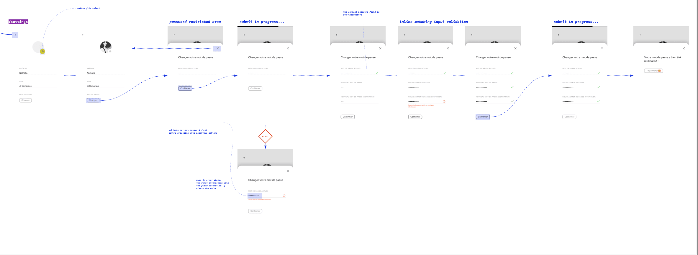
User flow & wireflow — miro

Wireframe — miro

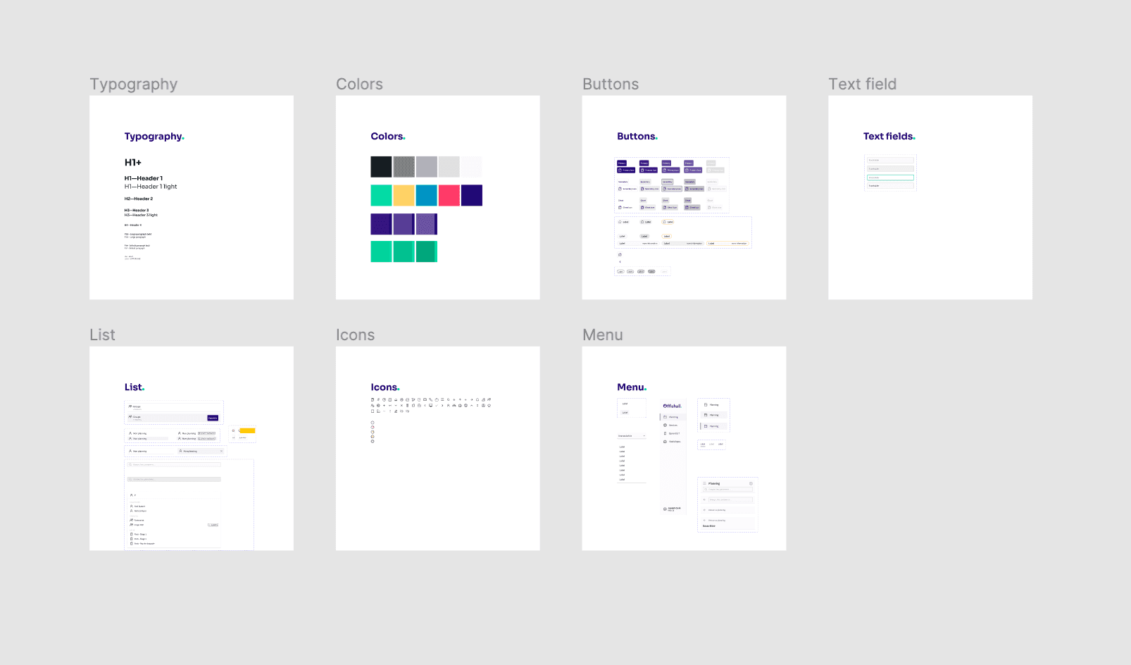
Style guide — miro

Joy, Privateaser

06.2021—03.2022

Goal : Help restaurant managers centralise and manage customer bookings

Joy, Privateaser

06.2021—03.2022

Goal : Help restaurant managers centralise and manage customer bookings

Joy, Privateaser

06.2021—03.2022

Goal : Help restaurant managers centralise and manage customer bookings

Joy, Privateaser

06.2021—03.2022

Goal : Help restaurant managers centralise and manage customer bookings

Introduction

Do you want to celebrate your 30th birthday with your friends? Do you need a spacious venue for your wedding, which is just a few months away? Or do your colleagues want to organise an afterwork party for a special event?

But how do you find a good place to make this celebration unique and with all the services that you need?


Well, Privateaser is an online marketplace that will help you find the perfect restaurant, bar, room, place to organise your event and ask for special services like food and drinks.


My role was to redesign and define a new experience for the venue owner to meet customer demand. This service was completely new and needed more design assets and organisation for future improvement.


www.joy.io ->

Design system & Style guide — figma

UI Improvements -> Old version

UI Improvements -> New version

Design system -> Notion

Design system & specs — figjam

Mobile UI design — figma

Chance

08.2019—08.2020

Goal : Online coaching experience to help people find the job they really love

Credits : Giovanni Carnel—product designer & Bich-Trâm Pham—Brand designer

Chance

08.2019—08.2020

Goal : Online coaching experience to help people find the job they really love

Credits : Giovanni Carnel—product designer & Bich-Trâm Pham—Brand designer

Chance

08.2019—08.2020

Goal : Online coaching experience to help people find the job they really love

Credits : Giovanni Carnel—product designer & Bich-Trâm Pham—Brand designer

Chance

08.2019—08.2020

Goal : Online coaching experience to help people find the job they really love

Credits : Giovanni Carnel—product designer & Bich-Trâm Pham—Brand designer

Introduction

Chance is a web application that is part of the PsyTech in France. The aim is to help people on their career journey by providing an auto coaching platform where they can reflect on themselves.

They do some introspection exercises on the platform while being helped by a certified coach via video call.


During this project, I worked closely with product designers, UI designers, Product managers, coaches, developers and psycologists to ensure that we created a consistent and customised experience for our users. The aim was to provide a mobile and desktop application with a simple but outstanding experience. We created a new brand and a new design system for that purpose to provide an online self development experience.


Chance.co ->

New user experience

The first experience was desktop only. It was really linear and the content was not matching the user interaction. The challenge was to provide a mobile experience where people can feel confortable reflecting on themselves.

That’s why we created a brand based on simplicity and neutrality, so that they can express their feeling.

UI Improvements -> Old version

UI Improvements -> New version

Discovery & wireflows — miro

Prototype & user test — adobe xd

UI design — sketch

Style guide & brand — sketch

Cronycle

03.2018—08.2018

Goal : Help journalists and professionals curate their content and news alerts.

Credits : Valérie Pegon—Senior UX researcher

Cronycle

03.2018—08.2018

Goal : Help journalists and professionals curate their content and news alerts.

Credits : Valérie Pegon—Senior UX researcher

Cronycle

03.2018—08.2018

Goal : Help journalists and professionals curate their content and news alerts.

Credits : Valérie Pegon—Senior UX researcher

Cronycle

03.2018—08.2018

Goal : Help journalists and professionals curate their content and news alerts.

Credits : Valérie Pegon—Senior UX researcher

Introduction

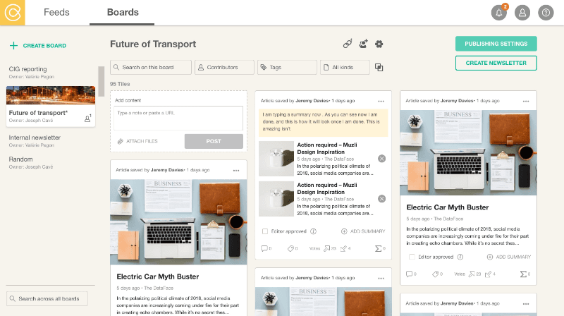
Cronycle is a web application that allows users to curate, collaborate and share news content with their teams. It’s a startup based in London where I work remotely closely with a senior UX designer to improve the user experience of the app.


First, we conduct user research through screener surveys, interviews and tests to identify personas and use cases. Then, we improve the interface with quick wins while building the design system to create a cohesion with the development team.


https://www.cronycle.com/ ->

UX Research

UI design -> Old version

UI design -> New version

Design system & Style guide — sketch